CRATE HUB
Enabling a Simple Way To Buy Vinyl Records In The Largest Online Music Database.
UX Design · UI Design · Visual Identity

KEY INFO
Crate Hub is a dashboard designed for the Discogs Mobile App, an online music database and physical music marketplace.
The project aimed to address user pain points, particularly the issue of cart abandonment during the checkout process.
Crate Hub introduces user-centric design features that enhance the overall user experience without breaking the design language to the existing users.
-
My Role: UX Designer and UI Designer.
Team: Myself and the RMIT Mentor.
-
Crate Hub introduces user-centric design features that enhance the overall experience by allowing customisation of favourite sections, simplifying the checkout process and enhancing the user interface without breaking the design language to the existing users.
THE PROBLEMS
FRUSTRATING MULTI-MARKETPLACE PURCHASE PROCESS

OUTDATED MOBLE UI DESIGN DOES NOT MEET USER EXPECTATIONS

TIME-CONSUMING TO DISCOVER MUSIC AND SAVE PROCESS

COMPETITOR ANALYSIS
Online research identified Discogs' three main competitors as Band Camp, Amazon Music, and niche physical outlets like Melbourne's Plug Seven record store.
Key findings revealed that Discogs is a market leader for physical music purchases, while Amazon Music has a broader base for online music sales. Significantly, many physical music stores depend on Discogs for extended online visibility.
USER RESEARCH AND INSIGHTS
Discog’s research provided key insights into the users’ experiences, mindset, goals, and pain points in the purchasing experience of vinyl records.
A series of structured questions guided our user research, culminating in face-to-face interviews with vinyl record buyers to understand their app interactions.
A recurring observation was the users' overwhelming experience with the search and add-to-cart functionalities within the app.
RESEARCH FINDINGS

-
Research indicated that Discogs trails behind in music search and discovery capabilities compared to its rivals.
-
There's an opportunity to revamp the UI, aligning it with contemporary user expectations and transforming Discogs into a more appealing music discovery platform.
-
A scope for enhancing the add-to-cart and checkout processes, aiming to establish the app as an all-encompassing hub for music discovery and purchasing.

IDEATION PROCESS
During the Ideation Process, various methods and tools were employed to address the challenges identified in the current app experience.
The approach incorporated Personas, the Crazy 8 brainstorming technique, Paper Wireframes, and Storyboards that gave direction to prioritise the ideas, leading to mapping wireframes and delivering the final solution for prototyping.

The Crazy 8 technique sparked diverse ideas to address user feedback on the app’s outdated and frustrating experience.

Personas were created based on user interviews, providing valuable insights into user perspectives.

By storyboarding, we visualised how new features fit into the user journey, ensuring seamless integration into the prototype.
SKETCHES AND WIREFRAMES
Ideation and Process Mapping techniques shaped the product's architectural information, serving as a foundation for wireframes.
Variations were created and usability testing sessions were conducted to refine color schemes, UI elements, and transitions.


Special attention was given to customisable color blocks, navigation buttons, and search and save functions throughout the design process.

USER FEEDBACK AND IMPROVED ITERATIONS
Based on user feedback, several key improvements were made to enhance Crate Hub’s User Experience.
The result of this process is a personalised page that makes discovering music easy.
As the project focussed primarily on the vinyl records marketplace in the Discogs app, the name Crate Hub was selected as the records are usually stored in “Crates” and “Hub” to represent a space for users who are passionate about vinyl records.
THE FINAL DESIGNS

Crate Hub Dashboard · Dark Mode

Discovering Artists Page

Favourites Page

Check Out Page

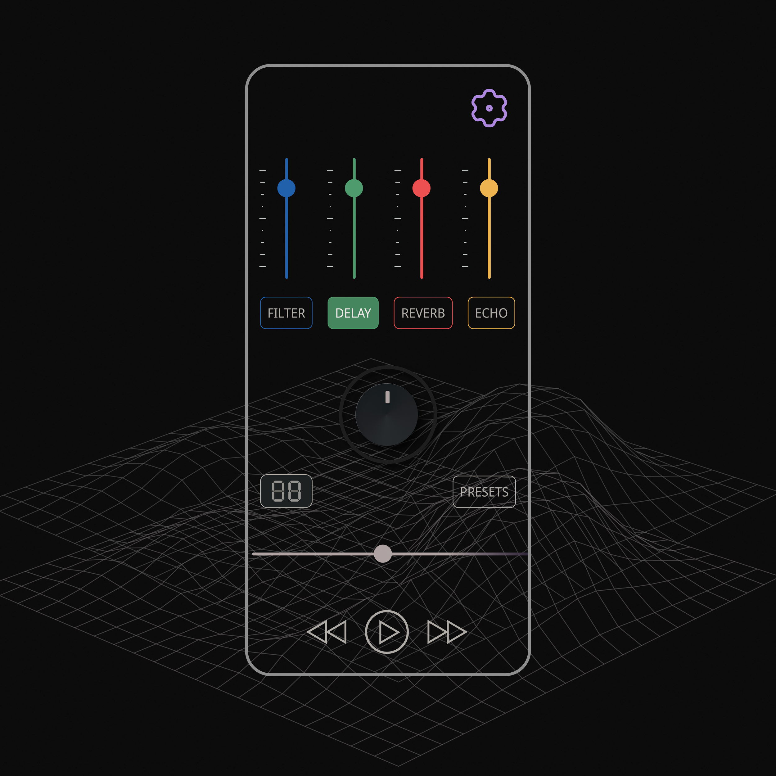
Song Radio Player

Crate Hub Dashboard · Light Mode
CONCLUSION
The final designs of Crate Hub with the improved new features received exceptionally positive feedback from the users and the mentor.
Users found the new section with customisable blocks to be highly useful, emphasising how easy it was to discover new music tailored to their preferences. This feedback demonstrates an improved user experience.
While I am pleased with the responses received, I recognise the importance of conducting usability tests and iterations with a larger user base to ensure the new designs and experiences are beneficial for all Discogs app users.
Thank you for exploring my UX Journey of Crate Hub.
More Projects
·
More Projects ·
SONIC WAVE PLAYER · UI DESIGN

JOB TETRIS · UX AND UI DESIGN

BRAND DESIGN PORTFOLIO

PERSONA DESIGNS · UX RESEARCH

GARAGE PROJECT · E-COMMERCE STRATEGY DESIGN
designs.by.asif
designs.by.asif